How to choose the right decorative painting?
There are millions of decorative paintings, in the end, which one is suitable for me? The first choice of decorative paintings to maintain unity with the overall style of the space, from the color, pattern to the material of the painting should be taken into account, if your home is a Scandinavian style, don't choose to bias Chinese bird and flower patterns, you should choose to have a modern sense of minimalist style decorative paintings.
How to pick the painting?
Today we do not recommend direct purchase of stores or paintings, after all, teaching people to fish is not as good as teaching people to fish, not to mention that we have different styles at home, different preferences, it is really difficult to exhaust the paintings suitable for everyone.
From the dimension of color, to give you a compendium of the two laws that can be referred to when selecting.
Law one:
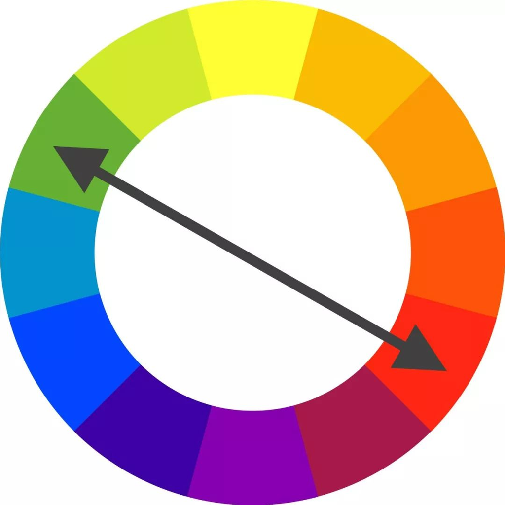
If you want to make the painting become a visual focus, let the main color of the wall painting, and the main color of the surrounding, to form complementary colors.
To review the knowledge of color: the so-called complementary colors, is in the hue ring about 180 degrees difference between the two colors, two colors collide, will produce a strong visual impact. For example, green and red: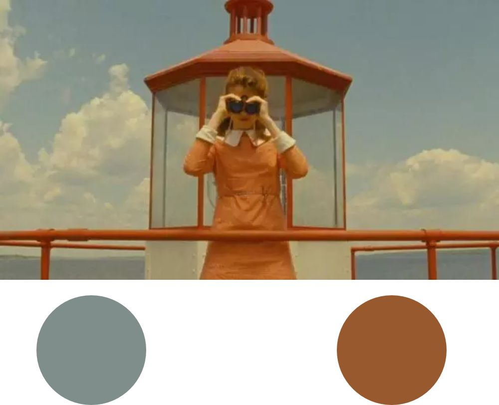
A movie stills picture illustrates this knowledge: blue sky as the background, the little girl and the ship's fence are wearing orange, this pair of complementary colors, so that the subject (the little girl) to stand out.
Clashing colors are meant to contrast, and contrast is meant to stand out.
If the hanging space around, with a large area of the main color (the main color can be walls, sofas, curtains, etc.), then this time, in order to let the hanging can be highlighted, you can choose the space of the main color of the complementary colors.
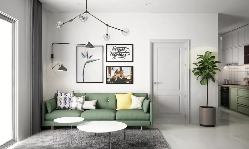
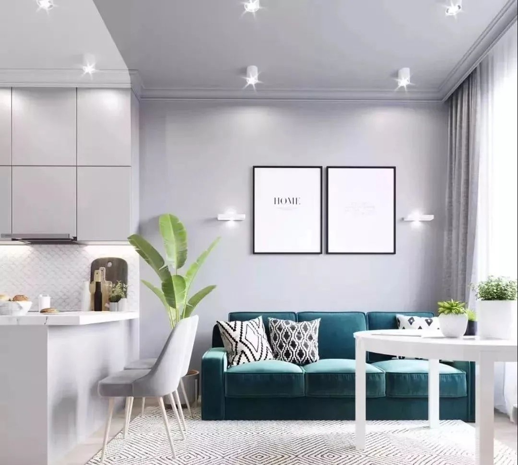
Case one:
The main color of the space: blue (sofa); hanging painting color: orange-red. Form a pair of complementary colors.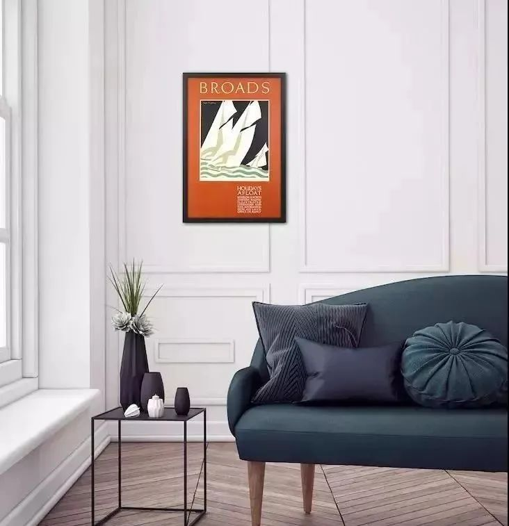
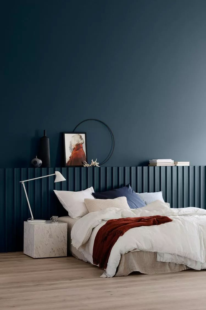
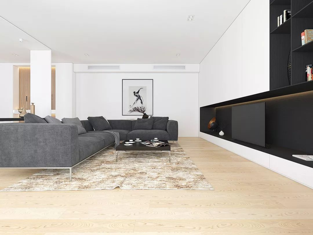
Case two:
The main color of the space: blue (wall); wall painting color: orange-red. Form a pair of complementary colors.